Appearance
Editing your website
Let's change some text and the colours of your website! If nothing in this documentation helps out with what you want to do, search TailwindCSS's docs along with the part that you don't understand (etc: text-sm) and it should show up - or message me and I'll personally help you out! Do refer to this picture on what you want to change.
How about company.vue? Once you read through these you should be able to edit company.vue too, or just message me for help
Classes
This covers most of the classes being used in the components
- text-sm: Text size is small
- font-semibold: Font thickness is semibold
- leading-6: Height of the text
- text-gray-900: Colour of the text
- sr-only: Screenreader only
- relative: position an element according to the normal flow of the document
- rounded-full: roundedness of the announcement border
- px-3: padding around the text, left and right
- py-1: same as above, only above and bottom
- ring-1: the border
- ring-gray-900/10: border colour, the
/10means opacity - hover:ring-gray-900/20: border colour gets darker when hovered
- absolute: absolute positioning via pixels
- sm:text-6xl: when the screen is above small width, the text size changes to
6xl - bg-indigo-600: background colour of the button
- shadow-sm: shadow + amt of it
- hover:bg-indigo-500: when you hover it changes to this colour
- focus: what shows when a keyboard focuses on the element, probably by using the
tabkey
navbar.vue
Table of Contents
1. Logo
This starts somewhere between line 6
vue
<NuxtLink href="/" class="-m-1.5 p-1.5">
    <span class="sr-only">Your Company</span>
    <img class="h-8 w-auto" src="https://tailwindui.com/img/logos/mark.svg?color=indigo&shade=600" alt="" />
</NuxtLink>
Logo: To change the logo link, change the link in src of the <img> component
Link: To change where it goes to when clicked, change the link in href of <NuxtLink> component
Span: This is for accessibility. You can change it so when screenreader users focus on the logo, the screenreader will read it out
2. Navigation links
To edit your links
ts
const navigation = [
  { name: 'Product', href: '#' },
  { name: 'Features', href: '#' },
  { name: 'Marketplace', href: '#' },
  { name: 'Company', href: '/company' },
]
To edit the font, positioning, etc. This starts somewhere between line 17
vue
<div class="hidden lg:flex lg:gap-x-12">
    <NuxtLink v-for="item in navigation" :key="item.name" :href="item.href" class="text-sm font-semibold leading-6 text-gray-900">{{ item.name }}</NuxtLink>
</div>
Div: Think of div as a group, the reason why it says hidden is because it can't be seen for smaller screens, smaller screens will have a full-screen menu, whereas larger screens will have the navbar
3. Button
This should be around line 20
vue
<div class="hidden lg:flex lg:flex-1 lg:justify-end">
<NuxtLink href="#" class="text-sm font-semibold leading-6 text-gray-900">Log in <span aria-hidden="true">→</span></NuxtLink>
</div>Button Label: If you go to the end of the first <NuxtLink> tag, you will see Log in along with <span>. You can safely remove the span part, but to change the button label, change the Log in part
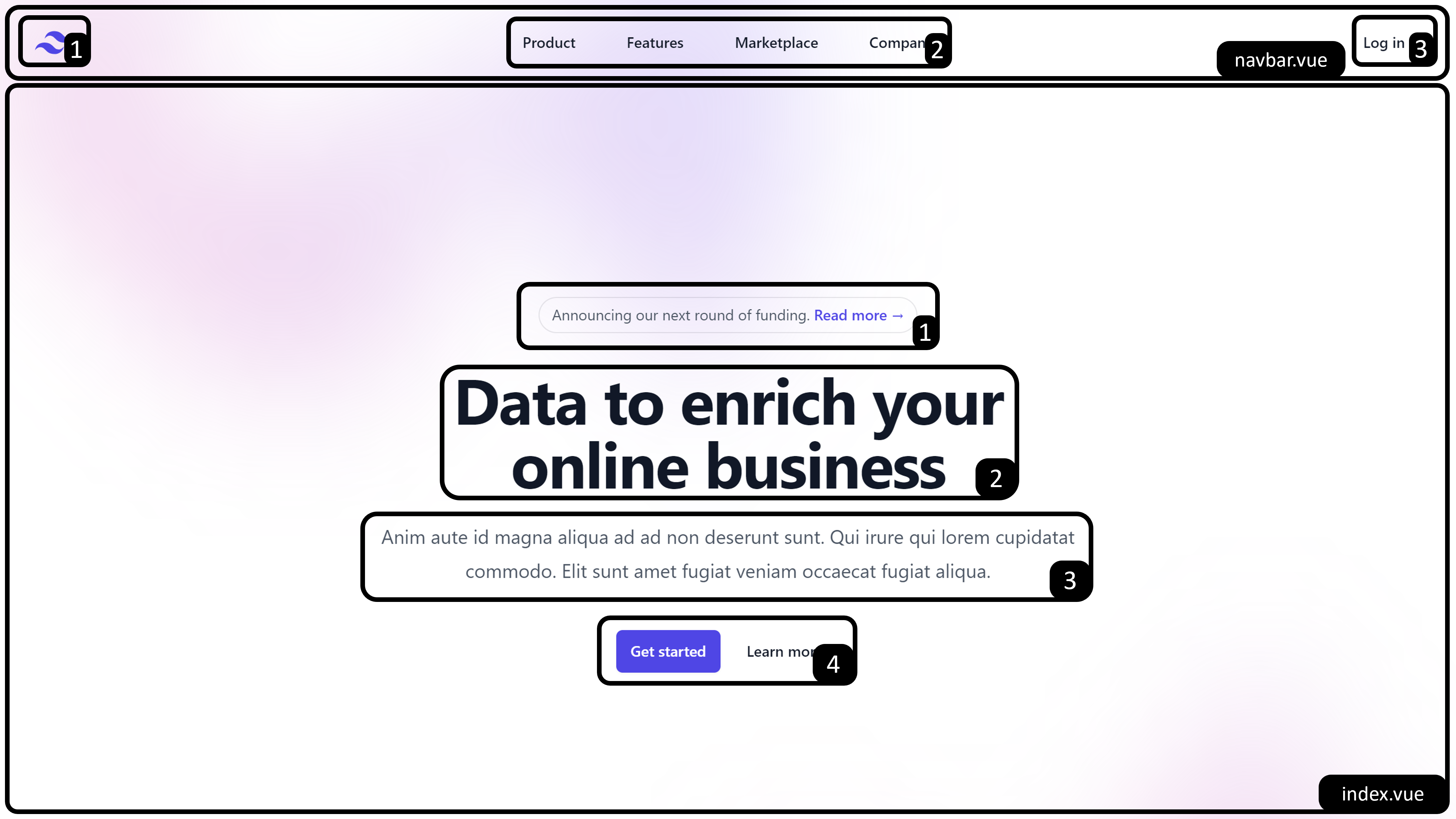
index.vue
Table of Contents
1. Announcement
This should be around line 10
vue
<div class="relative rounded-full px-3 py-1 text-sm leading-6 text-gray-600 ring-1 ring-gray-900/10 hover:ring-gray-900/20">
Announcing our next round of funding. <NuxtLink href="#" class="font-semibold text-indigo-600"><span class="absolute inset-0" aria-hidden="true" />Read more <span aria-hidden="true">→</span></NuxtLink>
</div>To edit the text: It's the Announcing our next round of funding part
To edit the link: It's the Read more part, you can change the link by the href= wrapped in <NuxtLink>
2. Title
This should be around line 15
vue
<h1 class="text-4xl font-bold tracking-tight text-gray-900 sm:text-6xl">Data to enrich your online business</h1>Edit the content by replacing the Data to enrich your online business
3. Description
This should be around line 16
vue
<p class="mt-6 text-lg leading-8 text-gray-600">Anim aute id magna aliqua ad ad non deserunt sunt. Qui irure qui lorem cupidatat commodo. Elit sunt amet fugiat veniam occaecat fugiat aliqua.</p>Edit the content by replacing the french part
4. Button
This should be around line 17
vue
<div class="mt-10 flex items-center justify-center gap-x-6">
    <NuxtLink href="#" class="rounded-md bg-indigo-600 px-3.5 py-2.5 text-sm font-semibold text-white shadow-sm hover:bg-indigo-500 focus-visible:outline focus-visible:outline-2 focus-visible:outline-offset-2 focus-visible:outline-indigo-600">Get started</NuxtLink>
    <NuxtLink href="#" class="text-sm font-semibold leading-6 text-gray-900">Learn more <span aria-hidden="true">→</span></NuxtLink>
</div>
Primary button (the one in purple): Edit the content by changing Get started
Secondary button (the one beside primary): Edit the content by changing Learn more <span aria-hidden="true">→</span>
5. Bonus: Gradient background
The top gradient should be around line 5, the bottom should be around line 23
vue
<div class="absolute inset-x-0 -top-40 -z-10 transform-gpu overflow-hidden blur-3xl sm:-top-80" aria-hidden="true">
    <div class="relative left-[calc(50%-11rem)] aspect-[1155/678] w-[36.125rem] -translate-x-1/2 rotate-[30deg] bg-gradient-to-tr from-[#ff80b5] to-[#9089fc] opacity-30 sm:left-[calc(50%-30rem)] sm:w-[72.1875rem]" style="clip-path: polygon(74.1% 44.1%, 100% 61.6%, 97.5% 26.9%, 85.5% 0.1%, 80.7% 2%, 72.5% 32.5%, 60.2% 62.4%, 52.4% 68.1%, 47.5% 58.3%, 45.2% 34.5%, 27.5% 76.7%, 0.1% 64.9%, 17.9% 100%, 27.6% 76.8%, 76.1% 97.7%, 74.1% 44.1%)" />
</div>
You can edit these
- Colours:
from-[#ff80b5] to-[#9089fc] - Rotation:
rotate-[30deg] - Opacity:
opacity-30
to whatever value you prefer